
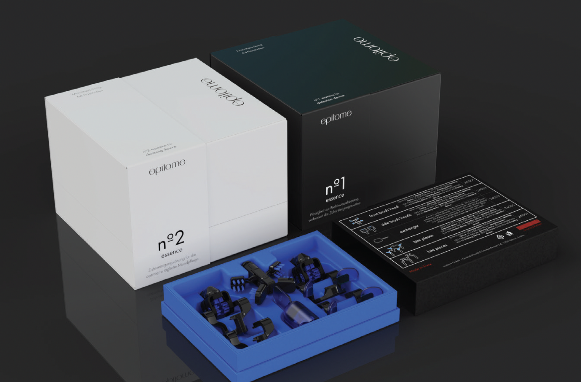
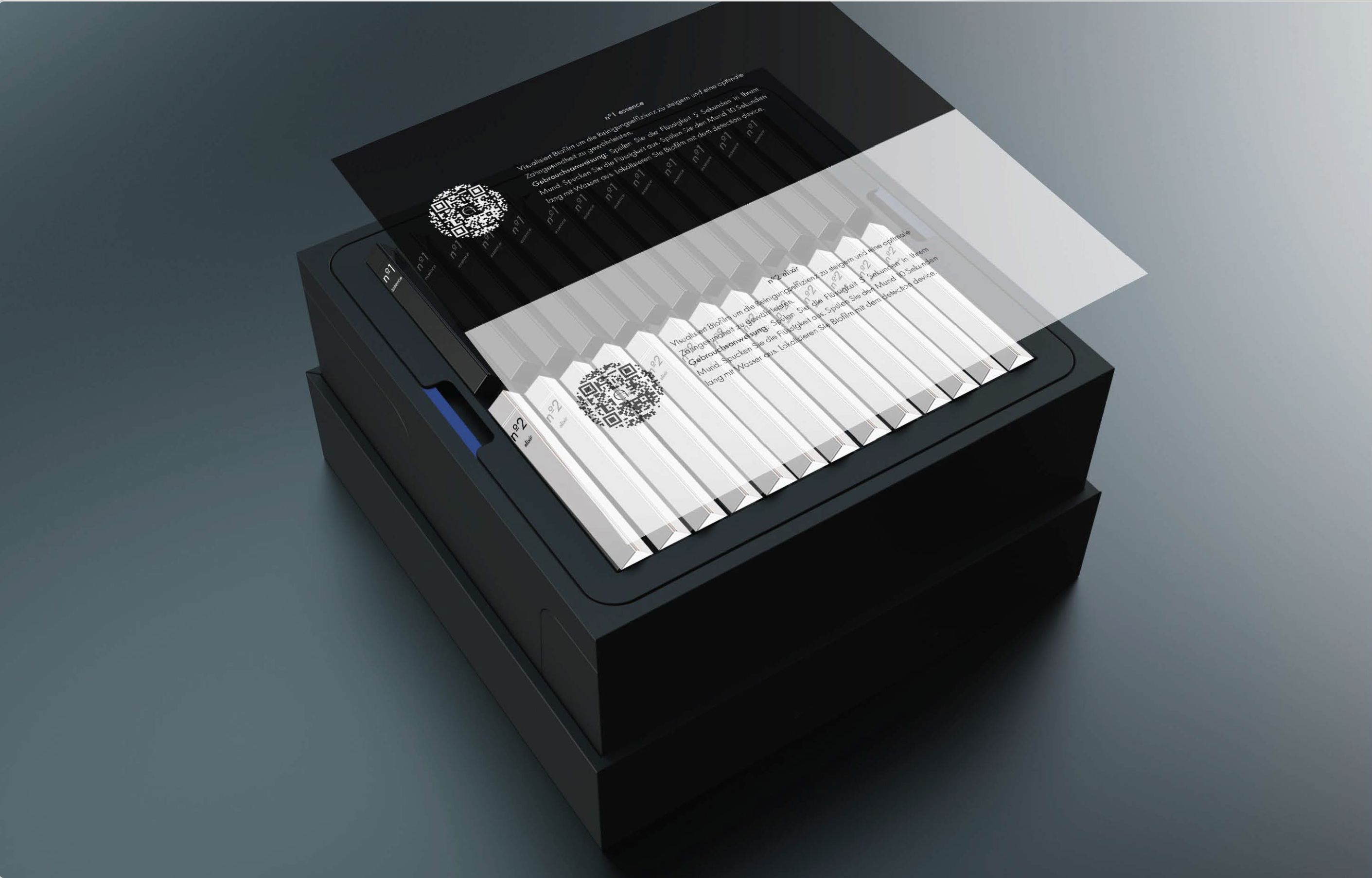
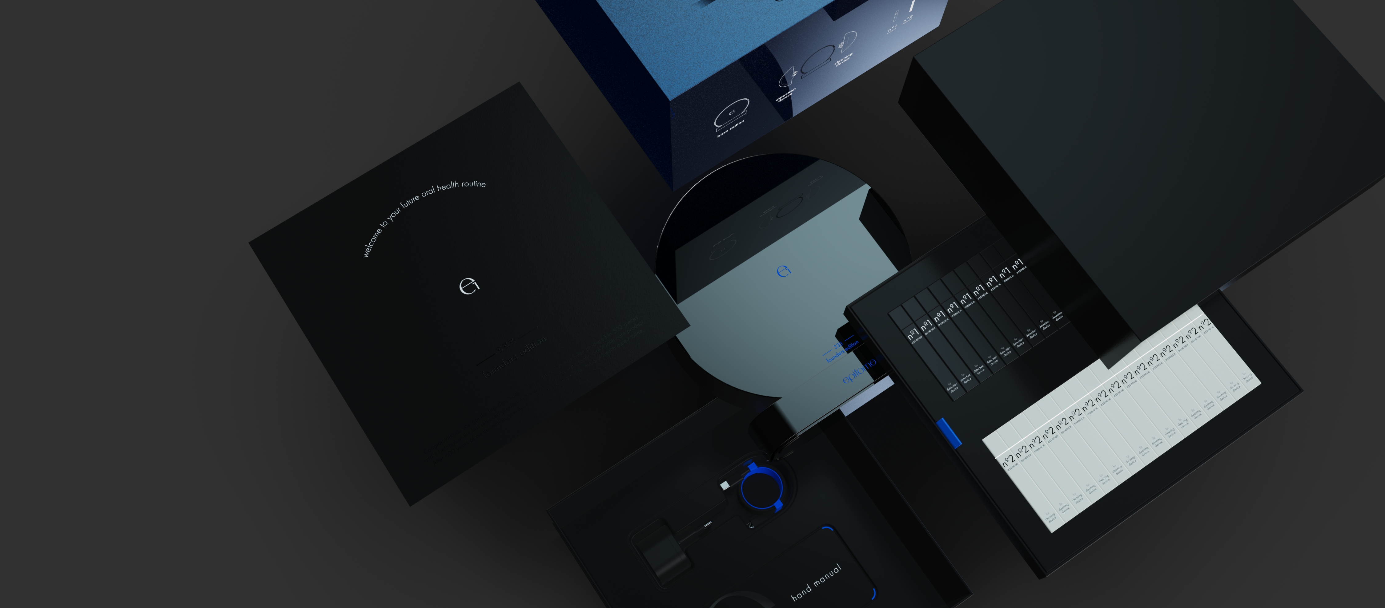
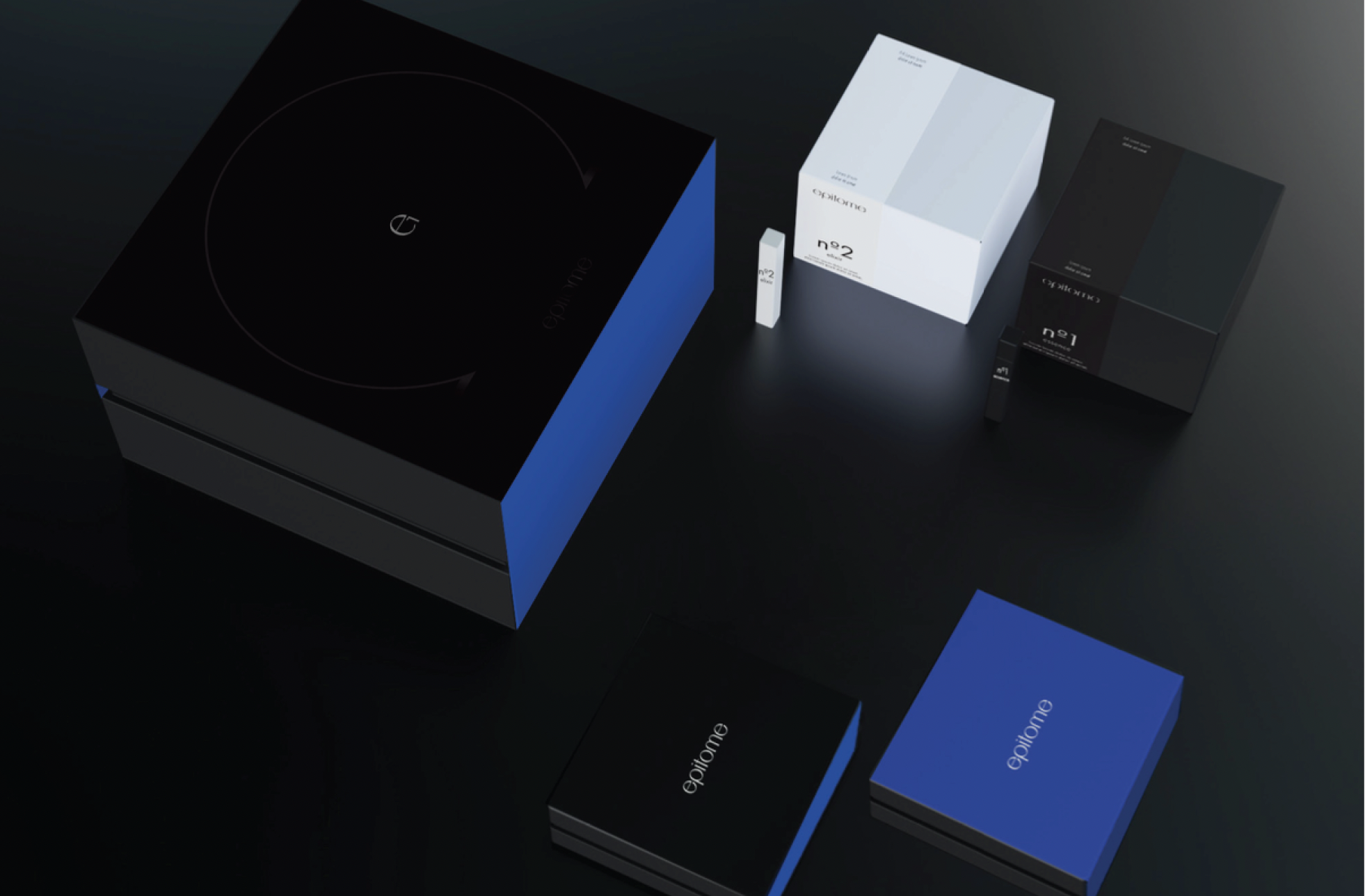
epitome
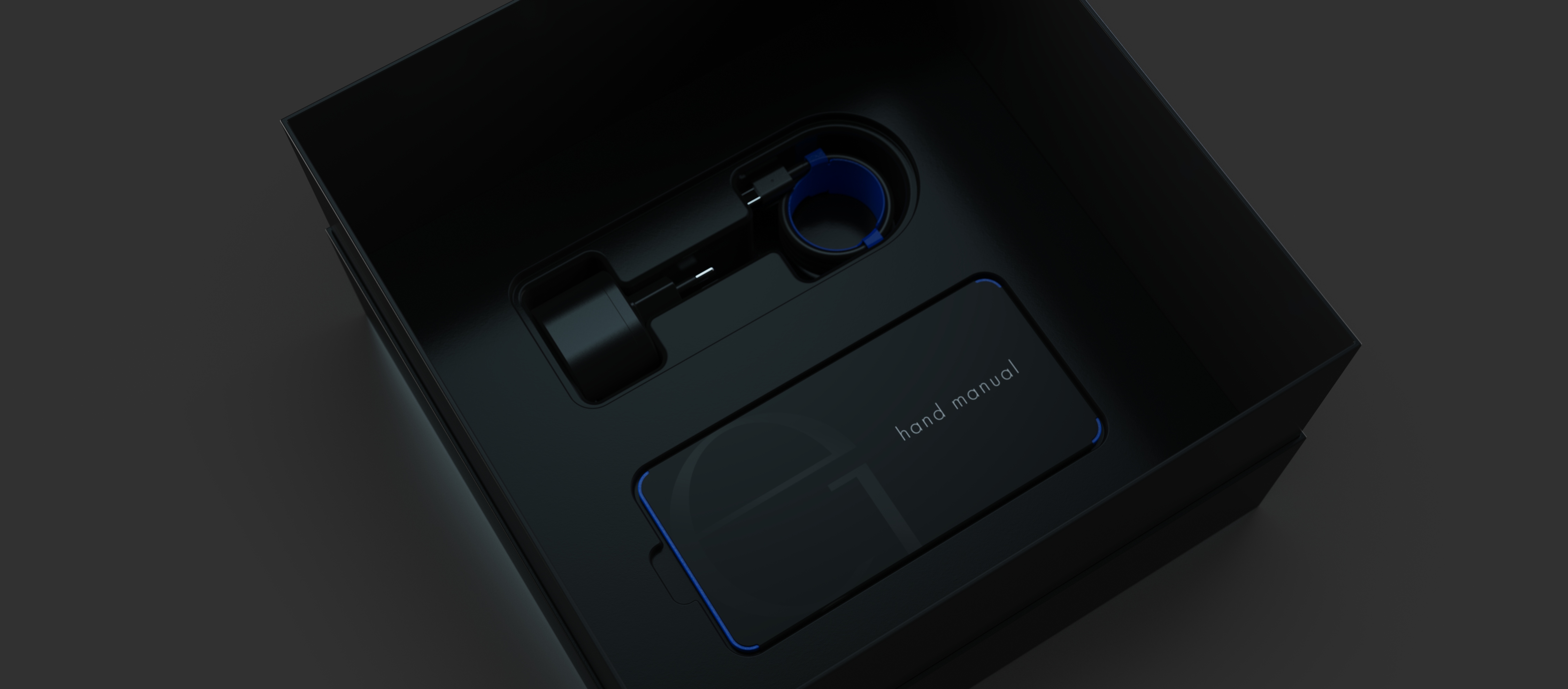
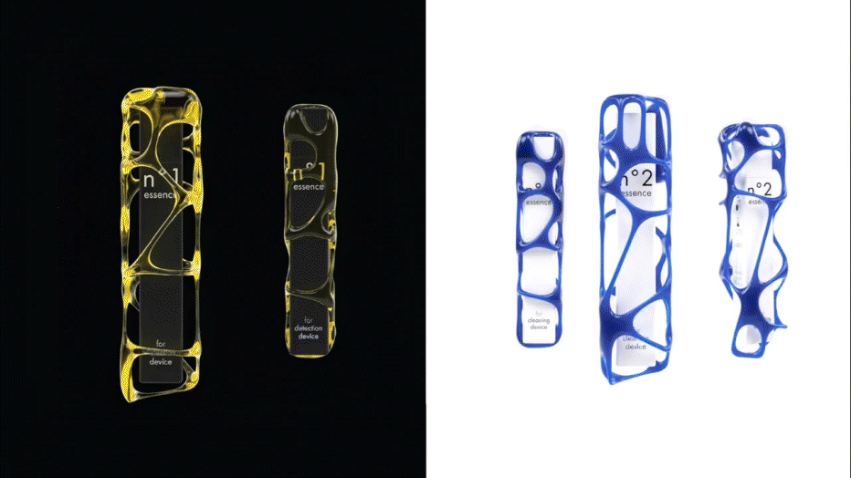
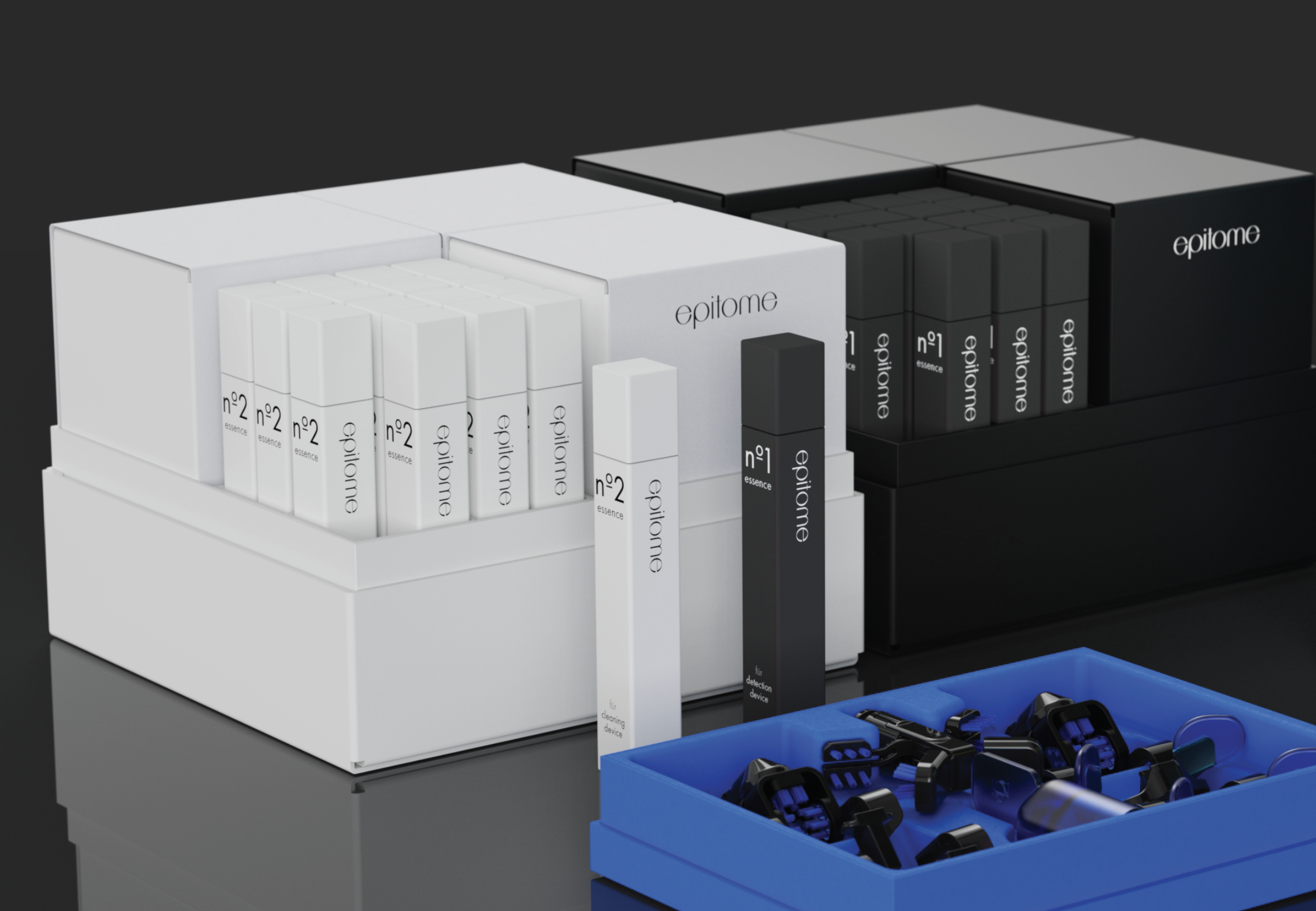
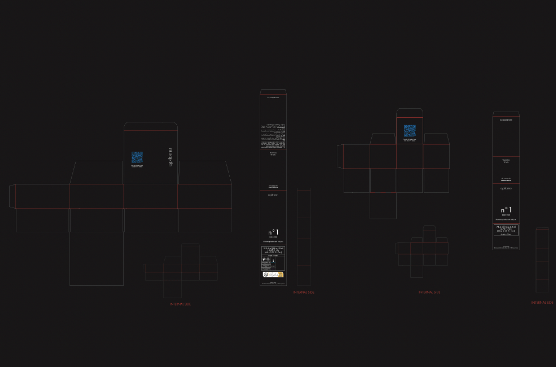
The e1 welcome package by epitome was designed in collaboration with the product designer, with Francesca Tosin contributing to the visual identity and packaging strategy to deliver a seamless user experience. The design spans the main product packaging, accessories, cables, power supply, and user manual, including a QR code to start unboxing and pairing the device.
The packaging concept ensures that every interaction maintains the high-tech standard and smooth experience of the first e1 use, including spare components and accessory boxes, reinforcing a consistent and engaging brand identity.
The packaging concept ensures that every interaction maintains the high-tech standard and smooth experience of the first e1 use, including spare components and accessory boxes, reinforcing a consistent and engaging brand identity.
Fila Underwear
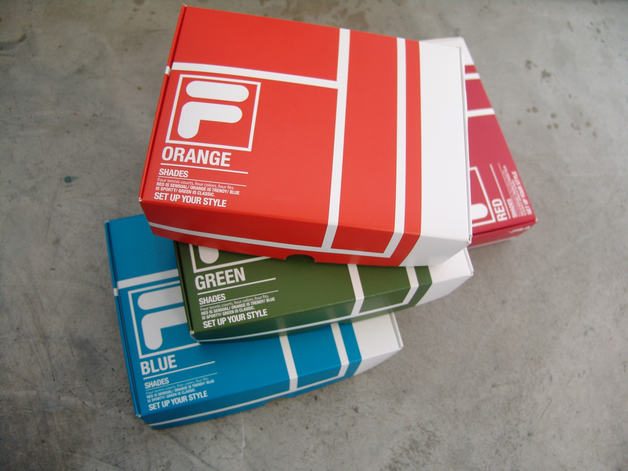
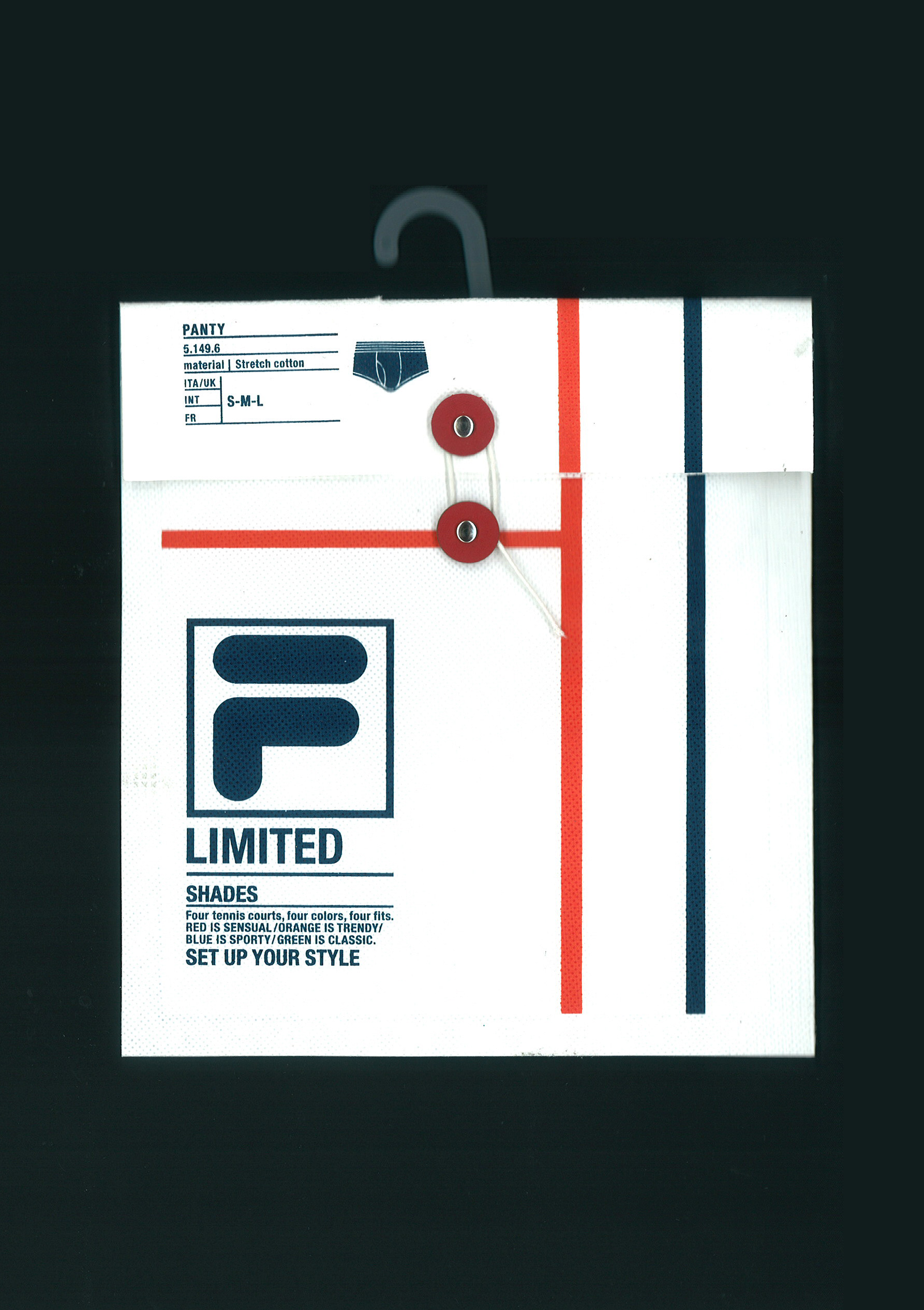
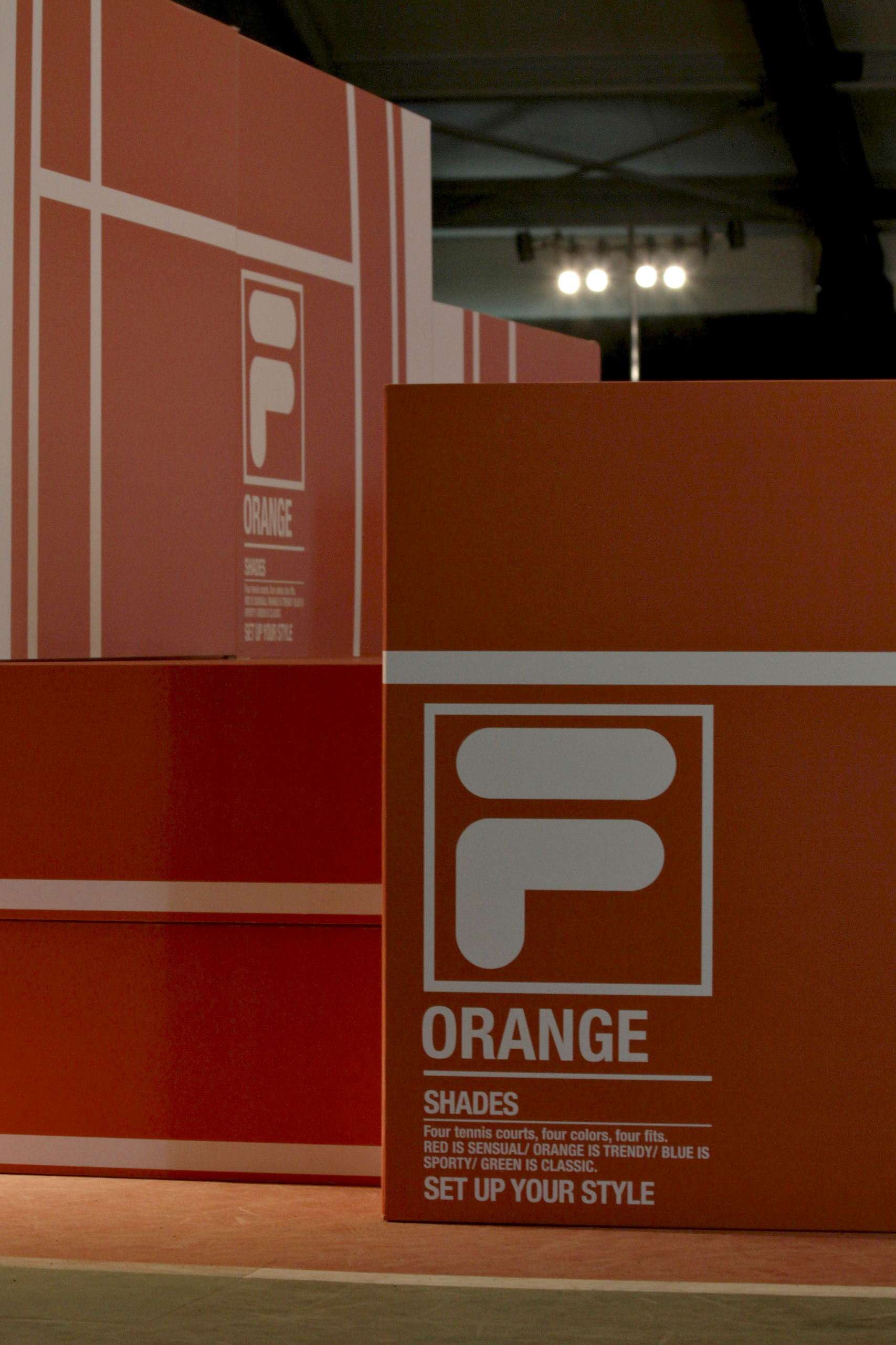
Established as an iconic Italian brand renowned for its tennis heritage, Fila carries a strong visual identity rooted in the sport. To revive and celebrate this legacy, the entire packaging line for Fila Underwear was designed by Francesca Tosin at Change Design, drawing inspiration from the graphic lines of the tennis court.
The collection was divided into four color variants, each referencing one of the world’s most emblematic tennis surfaces:
This color system allows the packaging to instantly evoke the brand’s sporting roots, creating a clear emotional connection between the product and the timeless imagery of international tennis.
The collection was divided into four color variants, each referencing one of the world’s most emblematic tennis surfaces:
- Orange – the clay courts of the Foro Italico
- Red – the red clay of Roland Garros
- Green – the grass of Wimbledon
- Blue – the hard court of the US Open
This color system allows the packaging to instantly evoke the brand’s sporting roots, creating a clear emotional connection between the product and the timeless imagery of international tennis.
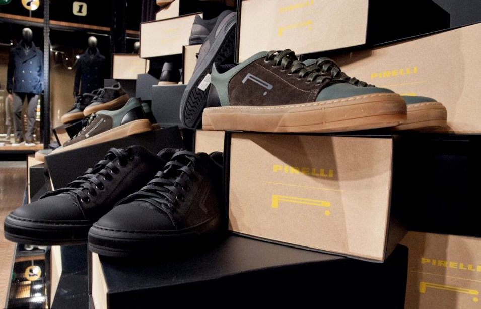

Pirelli PZero
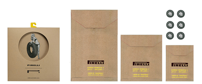
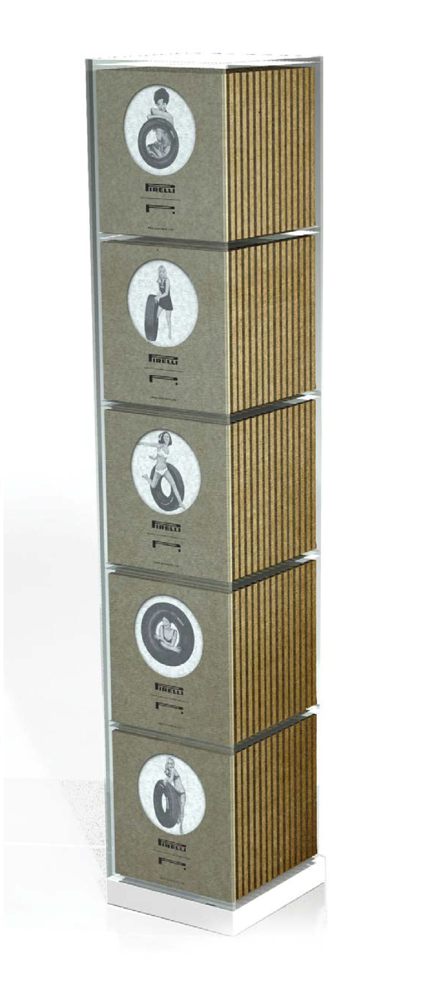
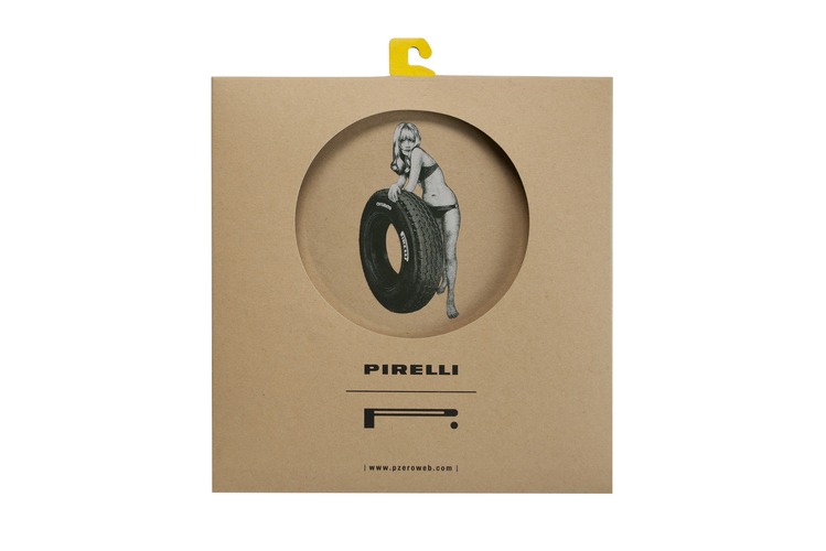
As part of the Pirelli PZero brand identity work, a dedicated focus was placed on developing a distinctive packaging language. Inspired by the rubber used in the production of F1 tires, the team—designing and developing the project at Change Design—chose to introduce craft paper as a contrasting, tactile material for the shopping bags, footwear packaging, and apparel packaging.
Special editions, such as the Pin-Ups T-shirts inspired by 1950s–60s Pirelli automotive advertisements, were also given their own tailored packaging solutions.
The iconic Pirelli yellow was used as a corporate color across packaging elements, referencing the varnish traditionally applied to F1 rubber models—creating a strong visual connection between heritage, materiality, and contemporary brand expression.
Francesca Tosin contributed to shaping this cohesive packaging language, ensuring every element reinforced the brand’s roots and its innovative identity.
EXR Performance
The complete rebranding, positioning, and strategy for EXR Performance, a Korean lifestyle apparel brand targeting 18–30-year-old customers, was designed and developed at Change Design. The project included a full redesign of the logotype and the creation of a new footwear segment structured as a satellite to the core apparel line.
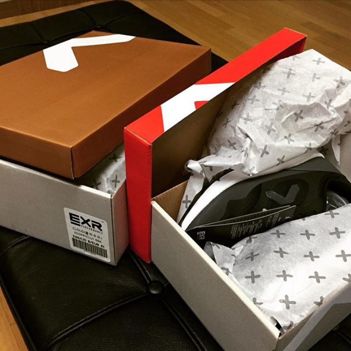
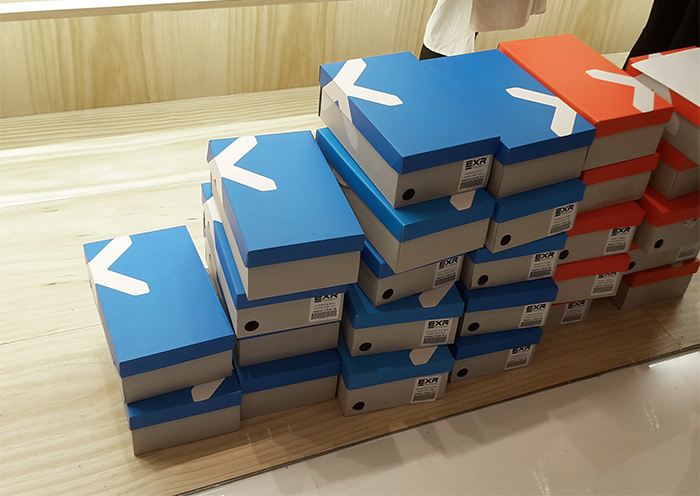
The visual language remains consistent across the brand while being thoughtfully adapted for the footwear collection, where reduced space requires more refined logo placement.
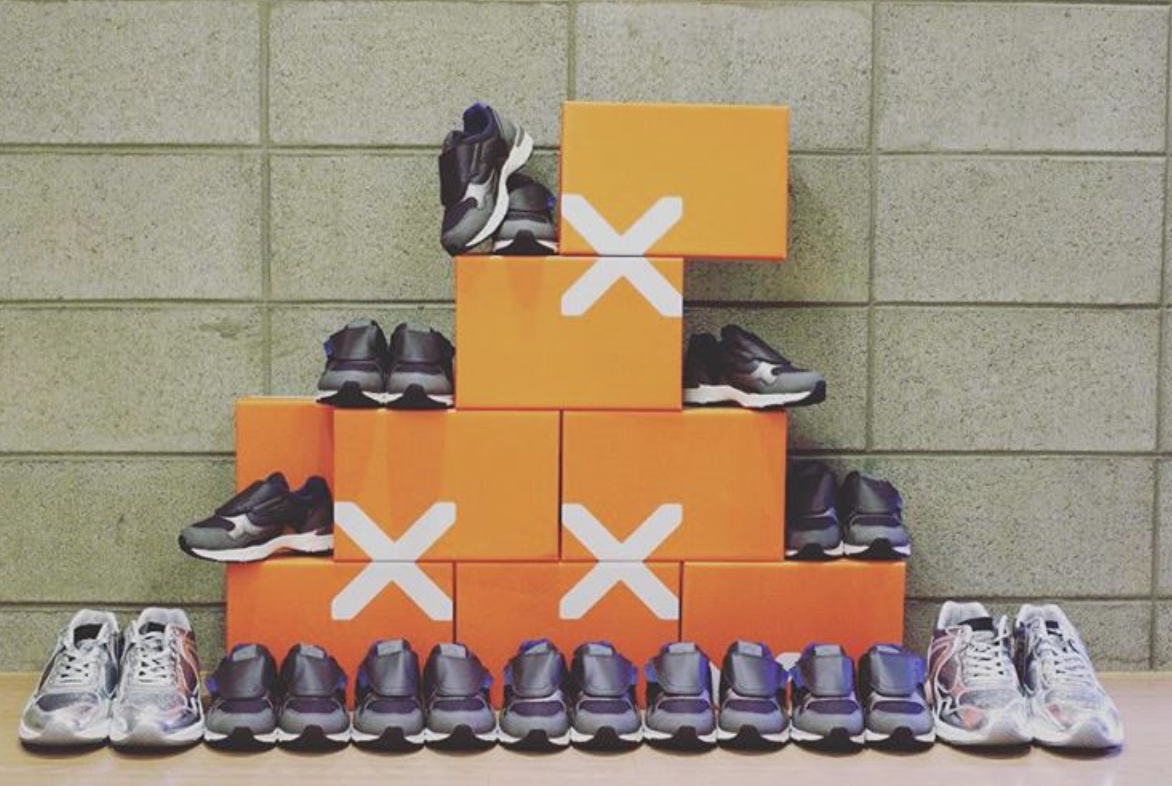
As part of the brand identity work, the entire packaging system was designed to preserve the segmentation of the four product lines: Active, Performance, City, and Heritage. The visual identity of the packaging has such a strong impact that the shoe boxes themselves can be used as a visual language to create bold and dynamic compositions.
Francesca Tosin contributed to building a unified yet flexible identity that supports and elevates diverse product categories.
The visual language remains consistent across the brand while being thoughtfully adapted for the footwear collection, where reduced space requires more refined logo placement.
As part of the brand identity work, the entire packaging system was designed to preserve the segmentation of the four product lines: Active, Performance, City, and Heritage. The visual identity of the packaging has such a strong impact that the shoe boxes themselves can be used as a visual language to create bold and dynamic compositions.
Francesca Tosin contributed to building a unified yet flexible identity that supports and elevates diverse product categories.